Challenges
1. Redesign product packaging to
reflect both premium quality and Indian
traditions.
2. Create a new logo that embodies the
brand's core focus on paint-related products.
3. Elevate the overall brand image to attract
discerning B2B customers.
Goals
1. Develop a brand identity that seamlessly
blends simplicity, professionalism, and
Indian cultural elements.
2. Implement a pricing strategy to position Shade
Shine as a premium product in the market.
3. Increase brand recognition and perceived value
among B2B customers.
Solutions
We came up with new packaging and
a fresh logo with their Indian roots to
show they're all about paint, so we can
present them very professionally and
attract premium customers.
Design Strategy
When it came to design, we wanted it to be simple so it could be recognised by
B2B customers.
As the client wanted the brand to keep their Indian roots, we incorporated a
minimalist design aesthetic with clean lines and ample white space and
integrated subtle mandala patterns to evoke Indian heritage without overwhelming
the design.
As the client wanted the brand to keep their Indian roots, we incorporated a
minimalist design aesthetic with clean lines and ample white space and integrated subtle
mandala patterns to evoke Indian heritage without overwhelming the design.


Copy Strategy
When it came to the copy of the brand, we decided to stick with an Indian touch by adding the
tagline made in India, and to build trust, we added the line in 1970, which was the year of the
establishment of the brand.
We wanted the brand to be conveyed in a very simple way, so we decided to add three simple
words that are very easy to grasp, i.e., paint tool cleaner, paint solvent and glass and wood cleaner.


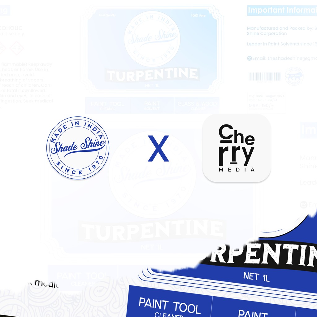
Logo Strategy
As it is a turpentine oil brand, we decided to design the logo to be flowy. The flowy concept conveys something
like flowing, as this product is used in the paints.
When it comes to the colours, we initially chose red, but as red indicates hazardous, we opted for blue, which
defines trust and security. So the colour conveys Shade Shine as a brand where you can trust and feel secure.

Our Results

After the new branding, the sales doubled i.e., 2x. After the new branding, the sales doubled i.e., 2x.
After the new branding, the sales doubled i.e., 2x. After the new branding, the sales doubled i.e., 2x.
After the new branding, the sales doubled i.e., 2x. After the new branding, the sales doubled i.e., 2x.
After the new branding, the sales doubled i.e., 2x. After the new branding, the sales doubled i.e., 2x.
We
would be
delighted
to
collaborate
with you →
Open to New Projects

Challenges
1. Redesign product packaging to
reflect both premium quality and Indian
traditions.
2. Create a new logo that embodies the brand's core focus on paint-related products.
3. Elevate the overall brand image to attract discerning B2B customers.
Goals
1. Develop a brand identity that seamlessly
blends simplicity, professionalism, and
Indian cultural elements.
2. Implement a pricing strategy to position Shade Shine as a premium product in the market.
3. Increase brand recognition and perceived value among B2B customers.
Design strategy
When it came to design, we wanted it to
be simple so it could be recognised by
B2B customers.
As the client wanted the brand to keep
their Indian roots, we incorporated a
minimalist design aesthetic with clean
lines and ample white space and
integrated subtle mandala patterns to
evoke Indian heritage without
overwhelming the design.
As the client wanted the brand to keep
their Indian roots, we incorporated a
minimalist design aesthetic with clean
lines and ample white space and
integrated subtle mandala patterns to
evoke Indian heritage without
overwhelming the design.
Solutions
We came up with new packaging and
a fresh logo with their Indian roots to
show they're all about paint, so we can
present them very professionally and
attract premium customers.
Copy Strategy
When it came to the copy of the brand, we decided to stick with an Indian touch by adding the tagline made in India, and to build trust, we added the line in 1970, which was the year of the establishment of the brand.
We wanted the brand to be conveyed in a very simple way, so we decided to add three simple words that are very easy to grasp, i.e., paint tool cleaner, paint solvent and glass and wood cleaner.
Logo Strategy
As it is a turpentine oil brand, we decided to design the logo to be flowy. The flowy concept conveys something like flowing, as this product is used in the paints.
When it comes to the colours, we initially chose red, but as red indicates hazardous, we opted for blue, which defines trust and security. So the colour conveys Shade Shine as a brand where you can trust and feel secure.
We Would be delighted
to collaborate
with you
Open to New Projects

Our Results
After the new branding, the sales doubled i.e., 2x.